If you are a new homeowner, a starter home may not always provide all the space that you need. However, there are ways to visually open up your space and make it appear larger using some clever color tricks. Keep reading to discover how color can make a room look bigger and create the illusion of more space.
Understanding the Challenge of Low Natural Light in a Room
Rooms with limited natural light often suffer from:
- Uneven lighting that makes colors appear different throughout the room
- Darker areas that can make the paint look dingy
- An overall gloomy atmosphere that affects the room’s ambiance
Fortunately, there are several effective strategies to combat these issues and create a brighter, more welcoming space.
Start with a Bright Ceiling

One of the most impactful ways to brighten a room with low natural light is to focus on the ceiling. Painting the ceiling a bright white color, as opposed to a cream shade, can dramatically improve light reflection throughout the room. This simple change helps to:
- Bounce available light around the space more effectively
- Create the illusion of higher ceilings and a more open feel
- Enhance the appearance of wall colors by providing a neutral backdrop
- By starting with a white ceiling, you lay the foundation for a lighter, brighter room overall.
How to Choose the Perfect Wall Color
After years of having to deal with “renter grey,” you may be eager to pick a wall color that’s anything but. However, finding the perfect wall color is more than just picking a color that matches the furniture in the room. It involves choosing a shade that works well within the space while considering the effects of natural light and square footage on the color choice. The interplay of undertones and light is critical when choosing the right paint color.
Consider Natural Light vs. Artificial Light
If you’ve ever been thrilled by a paint choice at the store, only to be let down once you start to use the paint within your home, you can blame it on lighting. Light is the ultimate filter for your paint choice. Therefore, what may seem like an exciting paint choice under the high-powered lights of a big-box retailer may change once you use the same color in your home, where it’s infused with natural and artificial light.
Natural light tends to be cooler and more dynamic, while artificial light may range from amber to clinical blue. Knowing how light interacts with your paint choice can mean the difference between an airy sage and a muddy olive once the paint dries.
Factor in the Room’s Light Conditions

Another factor you’ll need to think about when picking paint is the room’s orientation. A north-facing or south-facing room can introduce light and shadow in a way that you never bargained for. North-facing rooms may make your paint color appear cold, while a south-facing room may make it appear as varying shades of warmth as the sun moves throughout the day. Navigating these challenges involves knowing how to choose warmer tones to balance the cool of a northern-facing room and vice versa.
Understand Undertones
Undertones are the subtle tint within a paint color that gives it its character—and they exist in every color. A color’s “family” doesn’t determine its undertone. For instance, blue can lean warm (think: a soft periwinkle with a touch of purple) or cool (like an icy blue with a grey base). The same goes for whites, greens, even neutrals. Warm undertones—found in shades like creamy whites, peachy beiges, and golden yellows—bring a cozy, inviting glow to a room. In natural light, warm undertones tend to shine and feel golden; under cool fluorescent light, they can appear slightly muted or muddy. In north-facing rooms, warm undertones help counteract the cool, flat light and keep the space from feeling dreary; in south-facing rooms, they can intensify depending on the amount of sunlight, so test your swatch at multiple times of day.
On the other hand, cool undertones—found in colors with grey, blue, or green bases—create a crisper, more refreshing feel. In natural light, cool undertones look crisp and clean; under fluorescent light, they tend to pop and feel bright. In north-facing rooms, cool undertones can amplify the already cold light and make a space feel chilly; in south-facing rooms, they can be a great asset, staying fresh and balanced even as the light brightens throughout the day.
What difference does undertone make in a room? A cool-undertoned white will feel clean and airy, while a warm-undertoned white will feel soft and welcoming. Choosing the right levels of warm and cool means the difference between a space that feels intentionally bright and one that accidentally reads as harsh or flat.
Learn the LRV
When it comes to brightening a room, one of the most useful tools is a paint color’s Light Reflectance Value, or LRV. This number—found on most paint chips and manufacturer websites—tells you how much light a color reflects on a scale of 0 to 100. Zero is pure black (absorbs all light), and 100 is pure white (reflects all light).
For a room you’re trying to brighten, look for paint colors with an LRV of 60 or higher. These shades reflect a significant amount of light back into the space, making the room feel more open and airy.
LRV is especially handy when you’re comparing two colors that look similar on a chip. A pale blue with an LRV of 78 will feel noticeably lighter in your space than one with an LRV of 60, even if they look nearly identical in the store. When in doubt, check the number.
Select a Base Color
Once you’ve settled on a color you love, use it as your starting point for the darker space. Keep in mind that the same color may look entirely different in a room with less natural light. Now it’s time to experiment with different concentrations of the color. Create paint swatches of the following:
- 75% concentration of the base color
- 50% concentration of the base color
- 25% concentration of the base color
Test each of these variations in the room—seeing how they look on different walls under different light conditions—to help you determine which concentration best achieves the desired brightness and ambiance. Since the colors are so similar, you might decide to use the 75% concentration on the walls that receive the most sunlight, and 50% concentration on the walls that are always in the shadow.
Get the Sheen Right
Before leaving the paint store with your favorite paint color, don’t underestimate the effect that sheen has on your choice. Sheen affects how light hits your space. Choosing a matte finish may soak up all the light, making a room feel flat. A satin finish provides just enough glow to bounce light back into the space. Picking the right sheen can help make a room feel more expansive and alive.
Add Accents to Amplify Brightness

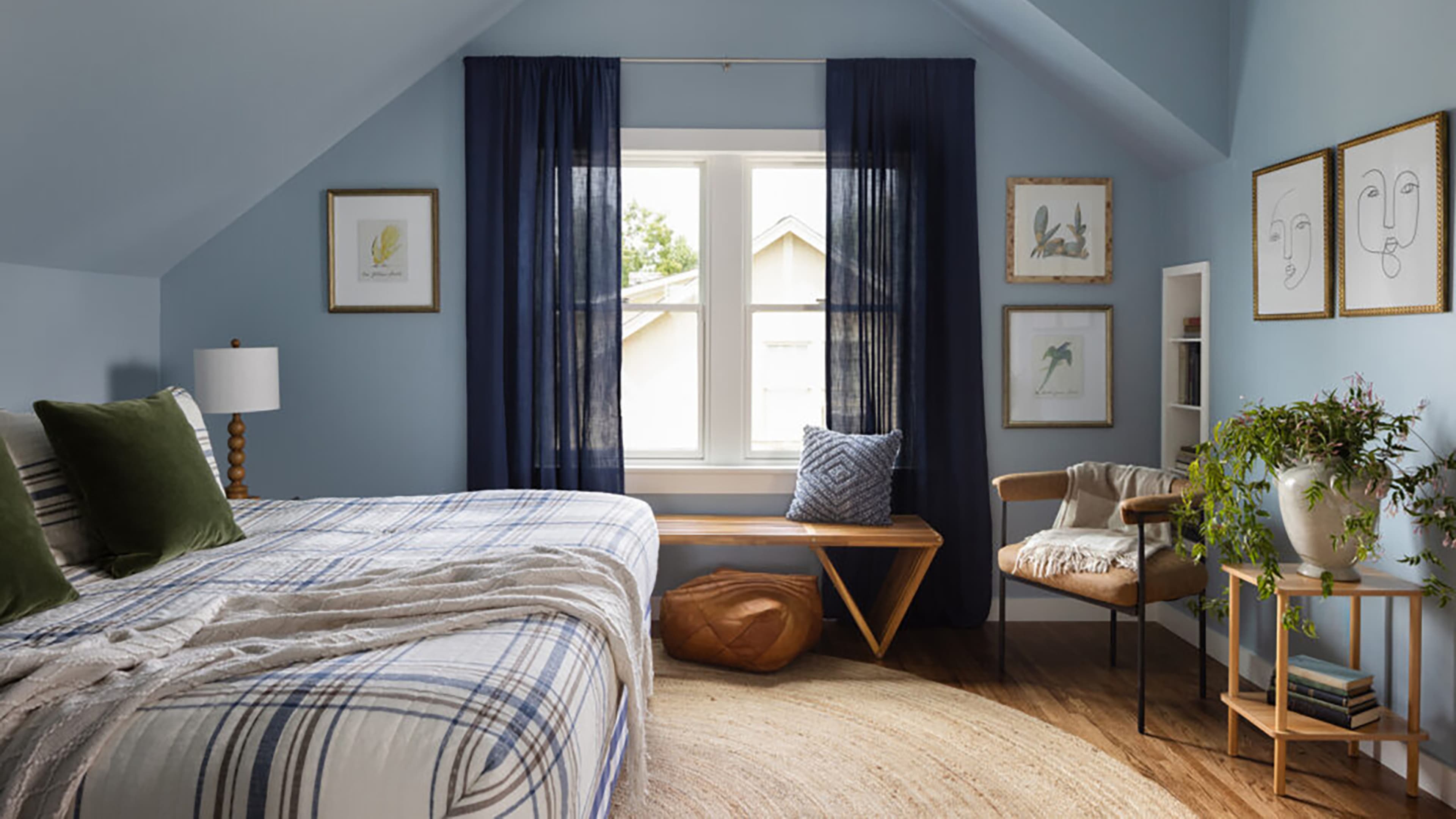
Consider incorporating mirrors, metallics, and glass decor. These elements can catch and reflect light, magnifying the paint’s brightening effects. Additionally, ensure that window treatments are light enough to allow for maximum natural light exposure, using sheer or light-filtering fabrics.
Maintain the Room’s Brightness
To keep your room looking bright and fresh, consider these regular maintenance tips:
- Regularly clean windows to allow maximum light
- Address any chips or marks in the paint promptly
- Dust light fixtures and reflective surfaces to keep them shining
Consistency in maintaining brightness can preserve and extend the longevity of your beautiful new space.